One of my classes has been exploring box plots and data landmarks lately. Earlier in the year the class created histograms and found data landmarks on line plots. Box plots was not as easy as a transition as anticipated. There were a few roadblocks as students analyzed and created their own box plots while determining Q1 and Q3. Some students picked up on the concept quickly while others took more time. To help reinforce the concept I thought about bringing in a spreadsheet activity. I have been using spreadsheets quite a bit this year and it has been another medium in which students can experience statistics.
Students were first asked to create a question that they would be asking the class. The numbers could range between 1-51. I gave students free rein on what questions to ask and held my breath.. Here were a couple of the survey questions:
- What is your favorite number between 1-51?
- How many hours of sleep do you get per night?
- On a scale of 1-50, what do you rate a cheese burger?
- How many movies have you watched this year?
- On a scales of 1-50, how well do you like dogs?
- How many digits of pi can you recite?
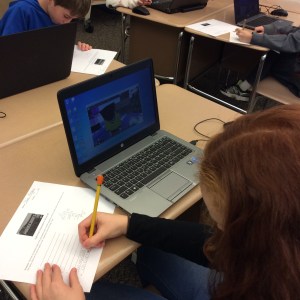
Once students created questions they went around and surveyed everyone in the class. I gave each student a roster list so they could check-off who answered This took a good chuck on time – 10-15 minutes. Once the data was collected students grabbed a Chromebook and copied a spreadsheet that I had pre-populated.
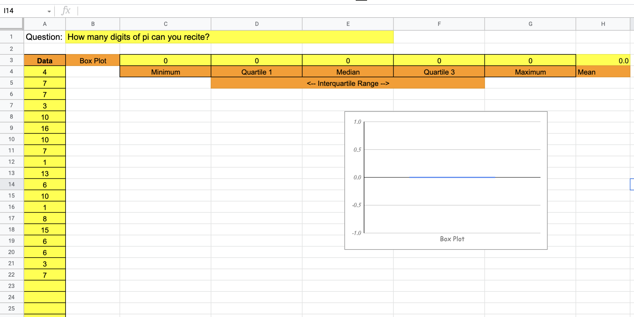
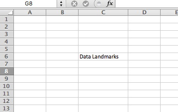
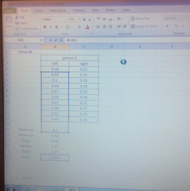
Students took the data from the survey collection sheet and transferred it to column A. The data landmarks in row three were placeholders and awaiting formulas. Students then entered the minimum, median, maximum and mean formulas. They were familiar with those formulas as we explored them earlier in the year. I discussed with the class about quartiles and we put together a formulas for Q1 and Q3. We made predictions of what the vertical box plot might look like before finalizing. Students then entered the formulas for the quartiles and analyzed the box plot to see if it matched the data.

It was interesting to hear the conversations that students had as they compared the data to the box plot. The class had a discussion about interquartile range and variability. It was time well spent. From there, students shared their spreadsheets with me and I took a closer look to see how the data matched and if the correct formulas were in the appropriate places. Students seemed to grasp the concept fairly well. Feel free to use a copy of the spreadsheet by clicking here.
During the next day the class reviewed box plots and the spreadsheets that were created earlier. Students then complete the Desmos task Two Truths and a Lie. This is one of my favorite tasks for students to discuss box plots and use math vocabulary while doing so.

The spreadsheet and Desmos task took about 2-3 days to complete. The class took a unit assessment on Friday and I will be checking out how they did over the weekend. I put these two activities in a digital folder for next year.